The Colors Defining Fall 2026 Interiors
Fall has always invited richer color into the home, but this year, the shift feels more nuanced.
Rather than the expected palette of burnt orange, rust, and seasonal brown, Fall 2026 is embracing colors with greater depth and complexity. Earthy greens, wine-inspired reds, softened yellows, and rich browns are creating interiors that feel warm and expressive without feeling overtly seasonal.
The most interesting part of this shift is not simply which colors are appearing, but how they are being used. Color is becoming less about following a trend and more about creating atmosphere.
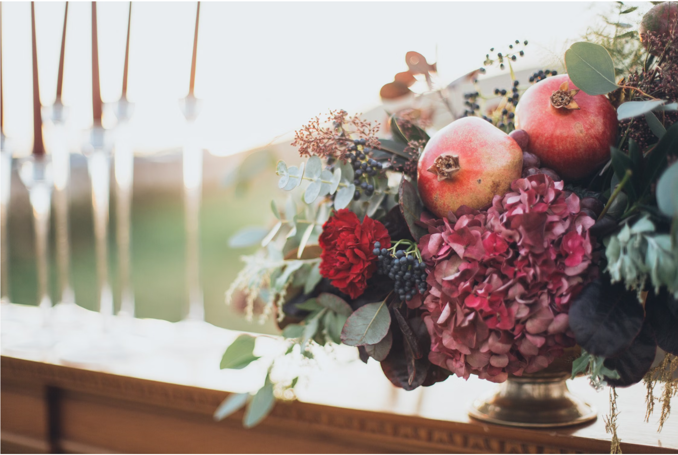
A richer, more nuanced approach to color for Fall 2026
1. Wine Reds
Burgundy has been building momentum throughout 2026, and this fall it is evolving into deeper wine and oxblood tones.
These shades bring warmth and richness to a room without the brightness of a traditional red. Paired with walnut, aged brass, warm ivory, or natural stone, wine tones can feel surprisingly timeless.
They also don't need to cover an entire room to make an impact. A velvet chair, patterned textile, painted cabinetry, or even a small upholstered piece can introduce just enough depth.
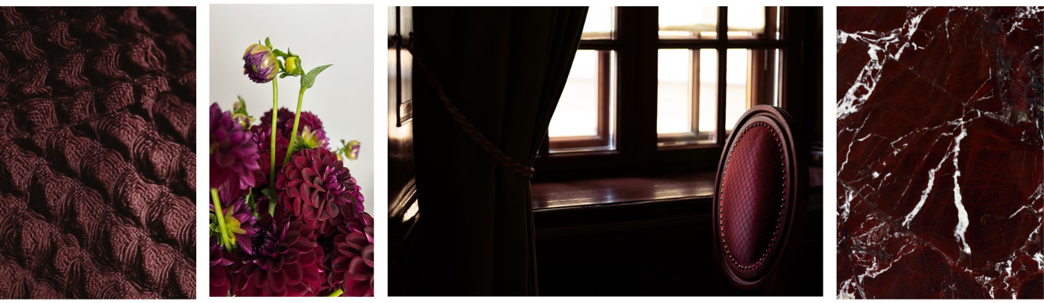
Wine-inspired hues layered through rich textiles, florals, furnishings, and natural stone bring depth and sophistication to fall interiors.
2. Earthy, Layered Greens
Green continues to have staying power, but the shades emerging this fall feel deeper and more complex.
Olive, forest, moss, and mineral greens connect naturally with wood, stone, linen, and other organic materials. Instead of treating green as a single accent color, layering several related tones can create a room that feels collected and dimensional.
There is something inherently calming about these colors. They bring the outdoors in while adding richness that feels especially appropriate as the seasons change.
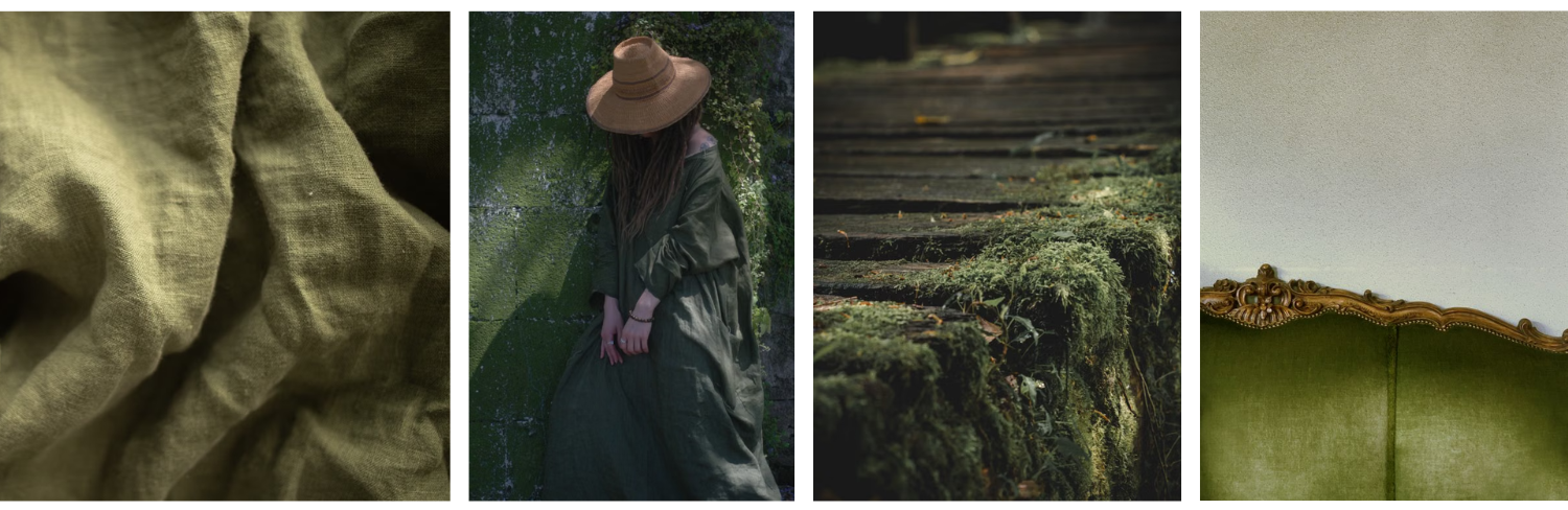
Layered shades of olive and moss create a grounded palette inspired by natural textures, aged materials, and the outdoors.
3. Rich, Deep Browns
After years dominated by pale woods and light neutrals, deeper brown is firmly back in the conversation.
Chocolate, espresso, and walnut tones add warmth and grounding to an interior. We are seeing this not only through paint and textiles, but also through darker wood furniture, cabinetry, and millwork.
The key is contrast. Pairing these deeper shades with creamy whites, muted blues, natural stone, or warm metals keeps the overall effect sophisticated rather than heavy.
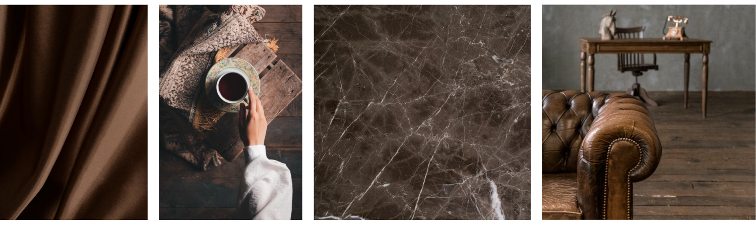
Warm brown textiles, dark wood, natural stone, and aged leather create a rich, grounded palette with timeless appeal.
4. Soft, Golden Yellows
Yellow for fall does not have to mean mustard.
This season's more interesting yellows are softened and slightly earthy, somewhere between butter, ochre, and muted marigold. They bring warmth into a room while still feeling light and approachable.
Used through textiles, artwork, upholstery, or a small painted space, these tones can introduce an unexpected glow, particularly alongside warm whites, natural woods, and deeper greens or browns.
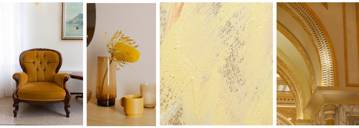
Soft ochre and golden hues bring warmth and luminosity through upholstery, decorative objects, texture, and architectural details.
A More Thoughtful Approach to Seasonal Color
The strongest color direction for Fall 2026 isn't any one shade, but a move toward colors that feel layered, personal, and enduring. Rather than designing around a trend, consider how color can complement what is already there, whether through paint, textiles, furnishings, or art.
The goal is to create a palette that feels fresh for the season, yet timeless enough to live with for years to come.
Ready to bring more color into your home? Book your complimentary 30-minute Discovery Call and let's explore the possibilities.